![]()
Background | Pages | Discussion | Technical Mastery | Technical Stack
Statement of Work | References | Appendix
Background
At the culmination of the Master of Applied Data Science program, Tia Burton, Joshua Nacey, and Joshua Raymond set out to create an approachable and secure portfolio management tool. Using computer science best practices, advanced statistical techniques, and various machine learning models, the group produced Market Shopper’s alpha version. This application evaluates a CSV portfolio for the expected returns and provides robust market analysis to help improve the quality of the portfolio. As a web-based template, students, investors, and portfolio managers can add, edit, or delete features to modify the product and launch new versions for their respective end users. Market Shopper, now available on GitHub, Docker, and a Google E2 VM, successfully democratizes financial analysis, educates on risk and opportunity within the context of current US markets, and promotes open-source learning.
Please see the overview video for the Market Shopper app below.
Pages
For this project, we focused on the four quintessential elements of financial analysis: risk, return on investment, diversification, and predictable returns (Simon, 2022). The application was designed to have a designated page per topic listed below; this strategy provided a focused view to help illuminate how much risk was a given portfolio taking on, which stocks might have improved the returns, and what the market might look like in the future. We continue to describe each page below, along with their respective impact, analytical approach, modeling approach, and ethical concerns.
Home Page
Impact
The homepage of Market Shopper is designed to give the user a quick, professional-level, visual overview of macroeconomic variables and their changes over the past week. We identify five different classes of variables – interest rates, equities/volatility, credit, foreign exchange, and commodities - and display a representative sample of the most important prices.
We utilize color intensity based on z-scores to give a sense of the relative magnitude of each change. The varying color intensity allows users to quickly assess the areas of the market that have been most volatile and develop a market narrative.
Analytical Approach
Z-Score
With concerns to the homepage, we used z-scores to help calculate and identify the volatility of a given variable. A z-score is calculated by determining the number of standard divisions the value is from the mean. This means that the mean has a z-score of 0 whereas a value that is one standard division away from the mean would have a z-score of 1.0. This is an important measurement as it helps determine whether a given value is “normal” for a particular dataset (Hayes, 2022).
Portfolio Page
Impact
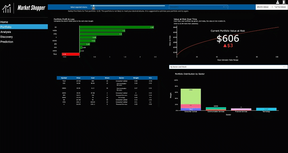
The Portfolio page offers an example of dashboarding for financial analysis and a range of concepts to explore, like indicators, common portfolio statistics, and risk and optimization algorithms. A test portfolio is included in the source code for the project. Information technology, computer science, data science, or finance students and aspiring portfolio managers can interact with the dashboard and decide whether the visualization methods used are effective and insightful or lacking details that could’ve made the shared information more compelling.
While Market Shopper is beneficial for demonstrating visualization efforts in an educational setting, the application is a functional tool. A portfolio selection widget allows an uploaded portfolio to be aggregated and analyzed by stock and sector. The analysis suggests if a portfolio is fit for the expected returns and shows which stocks are sectors that are low performing.
Note: The portfolio page is the slowest page of the application and might take some time to load. Please wait for all selections to load before making more. Could cause multiple processes to start with Dash, and the app may crash.
Analytical Approach
Roy’s Safety First
A user may be familiar with the traditional profit and loss metric, but financial analysis is a broad field with many metrics and techniques to explore. Roy’s Safety First Ratio was included because it is a probabilistic measure of risk for a portfolio, and skilled investors are familiar with acknowledging risk in the market and within their own portfolio. The metric tells the user how likely they are to achieve the expected returns they’ve selected (Winton, 2020).
Kenton, W. (2020). Roy’s Safety-First Criterion (SFRatio) Definition and Calculation
For each portfolio, users can leverage the value as a means to determine if they are getting closer to a portfolio that’s optimized for their desired returns.
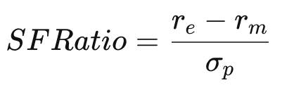
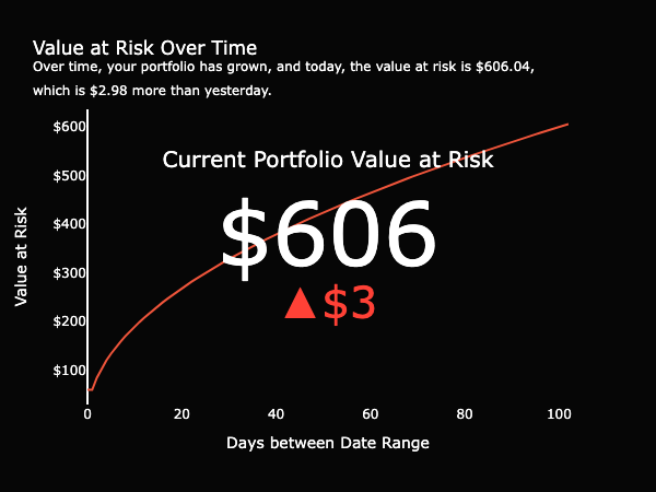
Value at Risk
Continuing to focus on risk, the Value at Risk measure helps a user better understand the risk and reward relationship involved in trading and investing (Kenton, 2022). Over time, a portfolio grows and shrinks given the fluctuation of the shares held. Value at Risk shows the maximum amount that may be lost while trading and is embedded to bring awareness to one’s own risk tolerance (Holton, 2002). Although users can watch their returns grow, they can also become more conscious of the risk of holding onto the shares for longer.
Ethical Concerns
Because this analysis is not exhaustive and doesn’t employ all indicators, techniques, and methods, there will always be some information not included that may help to better inform a user’s decision to improve the portfolio, continue holding as is, or sell everything. As a team of Master students, we have a duty not only to express the sentiment above but also to include a disclaimer that we are not licensed, financial advisors. This tool contains rudimentary financial analysis and is meant to be educational. Selling stocks based on a recommendation from the tool, regardless of its analytical validity, may cause long-lasting financial harm. In an attempt to mitigate this scenario, we have applied a license to the repository to explain our liability, added uncertainty to our visualizations, and strayed from providing explicit recommendations.
Analysis Page
Impact
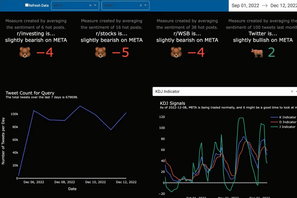
Signals often help investors select the best stocks to buy and sell. Our traditional and nuanced signals include a level of uncertainty, mixing sentiment based on small numbers of people and oscillators, like KDJ. Our analysis guides the users through the visuals to better understand the signals that are being shown.
Analytical Approach
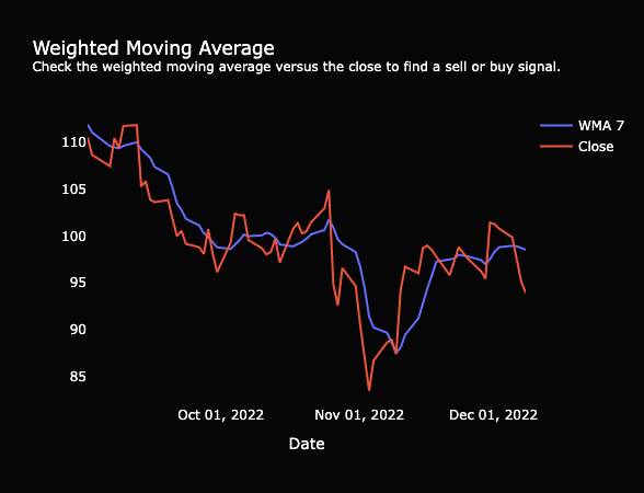
Weighted Moving Average
One well-known indicator is the weighted moving average (WMA). Often compared with the simple moving average or the close price of a stock, some use the indicator to dictate a perfect time to buy or sell (Fidelity, 2022). The Analysis page matches the WMA from the last 7, 30, 60, and 120 days to the close price for the selected stock. While browsing the market, a user might find stocks that have a WMA with a positive trend and it might be close to the stock price. We purposely did not add in any box plots or indications of closeness since this additional charting could cause users to take action without furthering their investigation of the stock. A user has to decide what is close enough to buy or sell. Hopefully, with continued use of the tool and additional education, a user would come to make their own call based on that closeness.
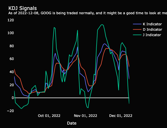
KDJ Indicator
The market is full of investors and continues to grow each year (Fitzgerald, 2021). Our secondary market indicator included in the dashboard starts to tell if the stock is overbought or oversold by the many. When a stock is overbought, the price is driven upward because there’s a lot of volume flowing in for trades and the price becomes competitive for the limited number of shares available. The opposite is true when a stock is oversold. An oversold indication, where the J indicator is below 20, is potentially a signal to buy (FGDT Academy, 2021). Yet, every signal should be followed by a comprehensive, deep dive into the balance sheet to be sure one knows exactly what one is buying.
Modeling Approach
Sentiment Analysis
Considering how investors have lost out on billions of dollars over the last few years with meme stocks (Walker, 2022), we thought it’d be best to capture the market’s sentiment given a stock. The sentiment of today might not always factor into a company’s future performance, especially if the company is selling to enterprise customers, and the sentiment is coming from those not in the target audience. Nonetheless, it may help to explain any chaotic or unexpected moment observed. For example, Google is a beloved tech company that releases delightful products year-round, yet, with fears of recession, it is expected to lay off a significant portion of its workforce, like many other tech companies in 2022 (Wolverton, 2022).
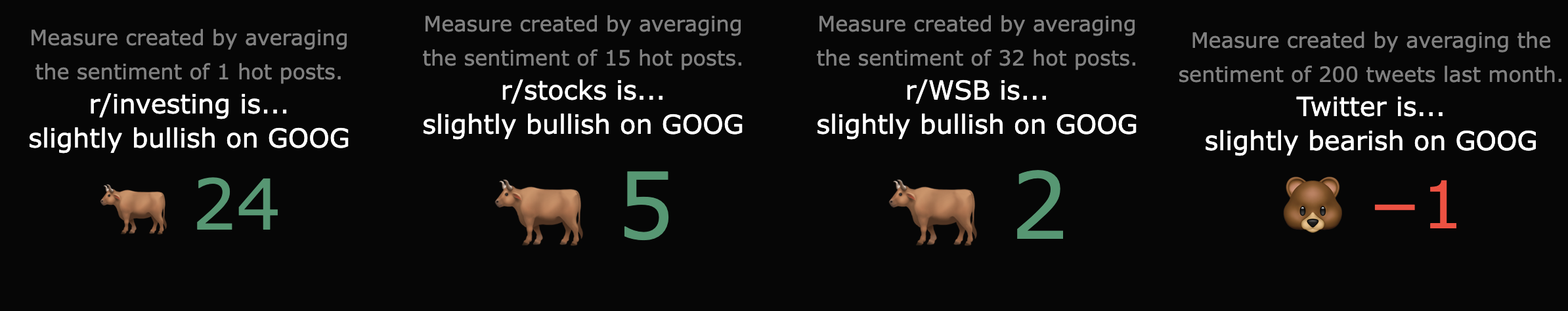
A user could view traditional market indicators next to the latest sentiment analysis across Reddit and Twitter to possibly start to build an explanation as to why there’s volatility or mass sell-offs for Google. The explanation they build may be secondary to that of actual business balance sheets, but this information is part of the complete market picture.
Ethical Concerns
The ethical concerns are similar to that of the Portfolio page. The Analysis page presents a limited analysis of a stock over a particular time period, and this analysis can change from one day to the next. A stock that looks promising on one day may have indicators to sell the next. Although most investors typically look for more information to confirm their decision, some traders look for signals from their peers to buy and sell stocks. R/wallstreetbets, a subreddit on Reddit, was and remains a major proponent of meme-stocks becoming a popular term and simultaneously making them something to be wary of. Investing in one of the companies that have become a meme-stock could potentially be financially detrimental to an investor/trader. The Market Shopper dashboard, though full of color, doesn’t gamify the market; it attempts to help users to better understand the market. Text is present on each visual to help explain the measure and to dissuade any hasty decision-making.
Discovery Page
Impact
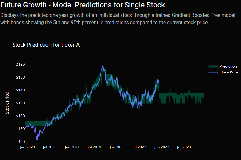
The discovery page helps users identify market trends within a particular sector or industry and discover stocks that may make for good investments. This discovery of investment stocks is done by displaying the past growth over the past year, showing the analyst growth for the next year, as well as the predicted growth from a Gradient Boosted Tree model (see the Discovery page’s Modeling Approach section above). This combination of data gives the user a broad understanding of the market trends by showing all stocks that file with the SEC in each scatter plot while also allowing them to filter down to a particular sector, industry, or individual stock. The user can also see an individual’s stock’s model prediction results with bands representing the 5th and 95th percentile prediction results. Please see the below video for a demonstration.
Analytical Approach
Lag Log Returns
Included in our dataset are lag log values. We obtain these lag log values by calculating the base 2 log up/down movement of a stock price between the current date and a past date, say one day or year. We then use these lag log returns as features in the Gradient Boosted Tree model (see below) since, as put by Yves Hilpisch, “…they might be informative in predicting future returns” (Yves, 2020). We take the log returns rather than the actual percentage returns as log returns give a stationary dataset to work from.
Modeling Approach
Gradient Boosted Tree (Scikit-Learn)
Regarding predicting individual stock returns, we used data from Fred, the Securities and Exchange Commission (SEC), and Yahoo! Finance and fed the data into a Gradient Boosted Tree regressor. While this model did not produce the highest train and test R2 scores (shown below) of all the models, it generalized well and produced reasonable predictions. In contrast, other models, such as the neural network model, produced results that predicted some stocks having a 14,000% increase.
Within this model, we also helped to show the uncertainty of the prediction by not only predicting off the 50th percentile of the dataset but also from the 5th and 95th percentile. These percentiles produced a lower and upper bound that could be used to show the range of values for a given stock (Koehrsen, 2019).
| Stock | Train Score | Test Score |
|---|---|---|
| MSFT | 0.998890 | 0.939923 |
| GOOG | 0.986133 | 0.963252 |
| AAPL | 0.994785 | 0.952516 |
| META | 0.994889 | 0.967503 |
| GE | 0.995829 | 0.937614 |
| GS | 0.946500 | 0.937343 |
| Avg Score | 0.986171 | 0.949692 |
From a results perspective, the Gradient Boosted Tree predictions for individual stocks are a bit bearish in comparison to the S&P predictions as well as the retrieved analyst targets. For example, within the Building Materials industry, analysts predict an average return of 17.6% whereas the trained Gradient Boosted Tree model predicts a -29.4% average return. While the model had R2 scores of .98 and .94 for the train and test sets respectively, these disparities may signal an ineffective model and further tuning may be required.
Ethical Concerns
Due to the predictions of individual stocks, the application user may consider these predictions, combined with other data on the page such as the analyst predictions and past performance, to be a solid indicator of where the stock will be in one year. While we hope that our predictions are accurate, the predictions will almost certainly not be 100% accurate as no individual can predict the oncoming of pandemics, natural disasters, geopolitical conflicts, etc. that will have broader impacts on the market as a whole. We hope that while the information provides useful insight to the user, they do not use the information to invest more into the market than they are willing to lose.
Prediction Page
Impact
Our prediction page gives users a sense of future market trajectories as predicted by several different machine learning and statistical algorithms. As disclosed earlier, these models evaluate current market conditions to predict future returns. We hope that users utilize this information to assess the level of risk they feel is appropriate.
Analytical Approach
To assemble a dataset that we felt would be useful in generating future market projections, we strived to balance the length of history and the breadth of features. In finance, this balance is particularly important as we have some data going back more than a century (i.e. interest rates) however other certain features (i.e. NAAIM Bull-Bear indicators) have only been measured over the past 20-30 years. We were thus forced to remove certain features to arrive at a dataset that goes back to the 1950s. We resampled this data into four different time periods (1 day, 5 days, two weeks, and one month) to test if different windows of time provide incremental predictive information. In each of our models, we use as a label the returns over various periods 1-120 days in the future from the date of the data vector.
Modeling Approach
Our results were successful in some areas and indifferent in others. One area in which we feel we excelled was our attempt to model dispersions of future market returns. We have found a Mean Absolute Percentage Error (MAPE) on the sample test sets in the 1-2% range as well as R2’s of over 80% across a multitude of time horizons. Our gradient-boosted tree model has performed the best out-of-sample.
Deep Learning Model (Keras)
Our deep learning prediction model was developed on the Tensorflow framework via the Keras high-level API. Our model is a sequential, multilayer perceptron implemented via Keras’ ‘Dense’ layers. We utilized the Keras-tuner library to help us tune the model’s hyperparameters. The Keras-tuner library can be used to specify a range of potential model hyperparameters (number of layers, nodes per layer, learning rate, etc) and then use an efficient grid search algorithm to discover the optimal model architecture.

We found the deep learning model predicted relatively high amounts of volatility in future market returns and showed relatively poor performance at predicting near-term market results, but showed acceptable results for longer time periods.
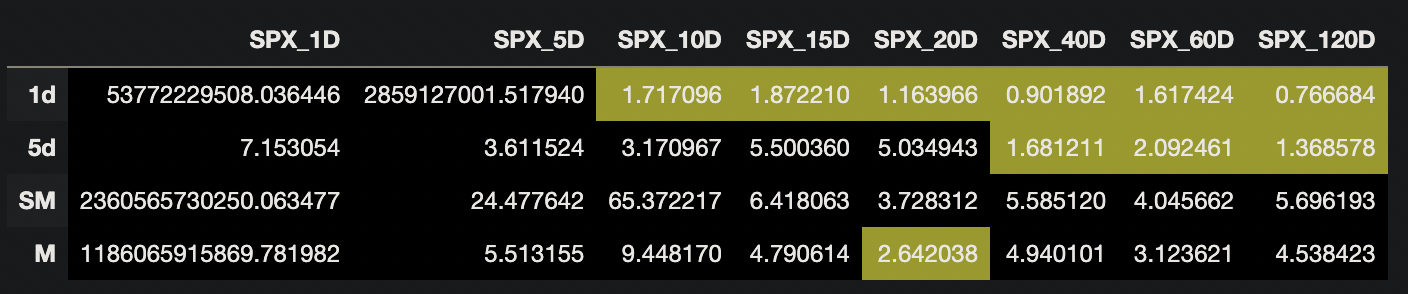
Below we showcase the mean average percentage errors, with error rates under 3 highlighted in yellow:
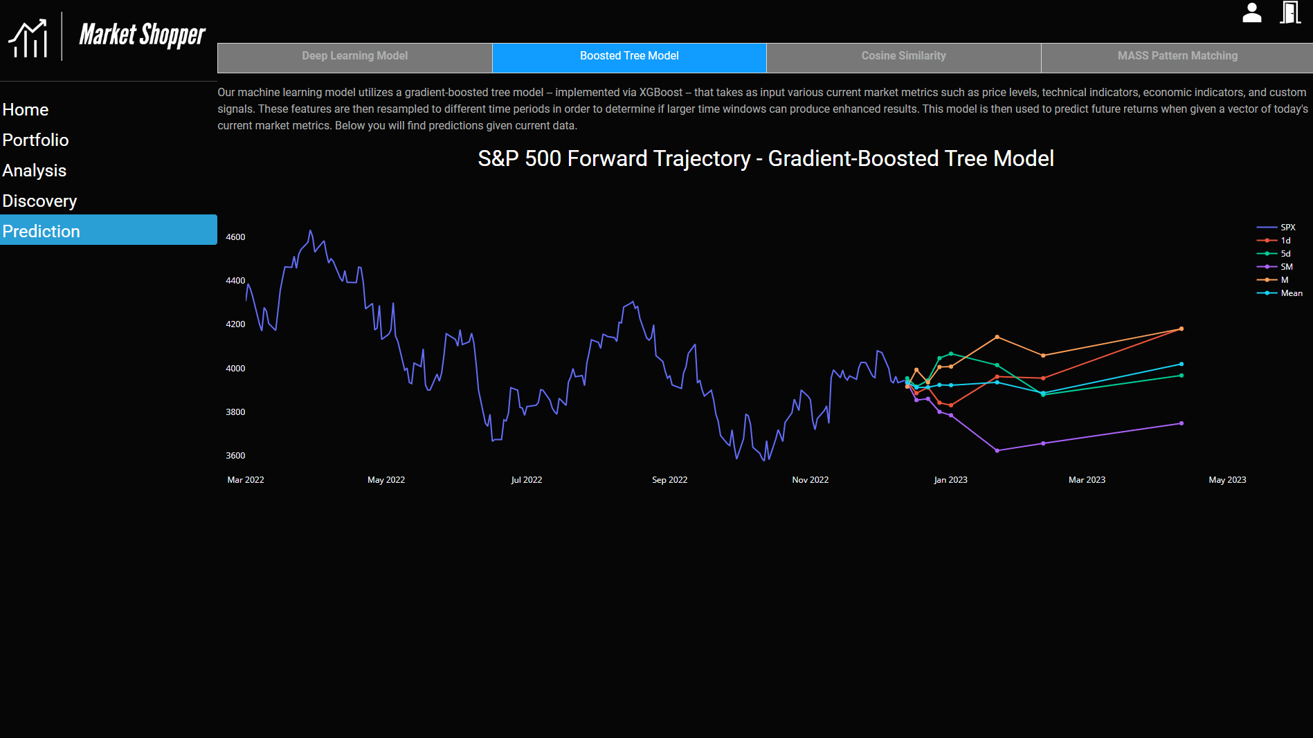
Gradient-Boosted Tree Model (S&P 500 Prediction)
Additionally, we wanted to employ another algorithm with a different architecture to our data to see if our predictions would change. Our thinking was that since the architectures are different, the models could make errors in different ways that could elucidate future returns. We employed a gradient-boosted tree model implemented via the XGBoost platform. Gradient-boosted tree models are a version of tree-based supervised learning models that attempt to use weak learners; training proceeds iteratively by adding new trees that predict the errors (or gradient) of prior trees. These trees are then combined to make the final prediction. We used a standard grid search method to identify the optimal parameters of the model.
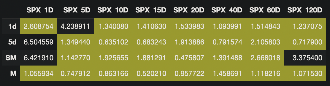
Our boosted tree model exhibited much lower errors than our deep learning model. This model generally achieved under 3% mean average percentage error in most cases. This model’s respective mean average percentage errors are shown below, with error rates under 3% highlighted in yellow:
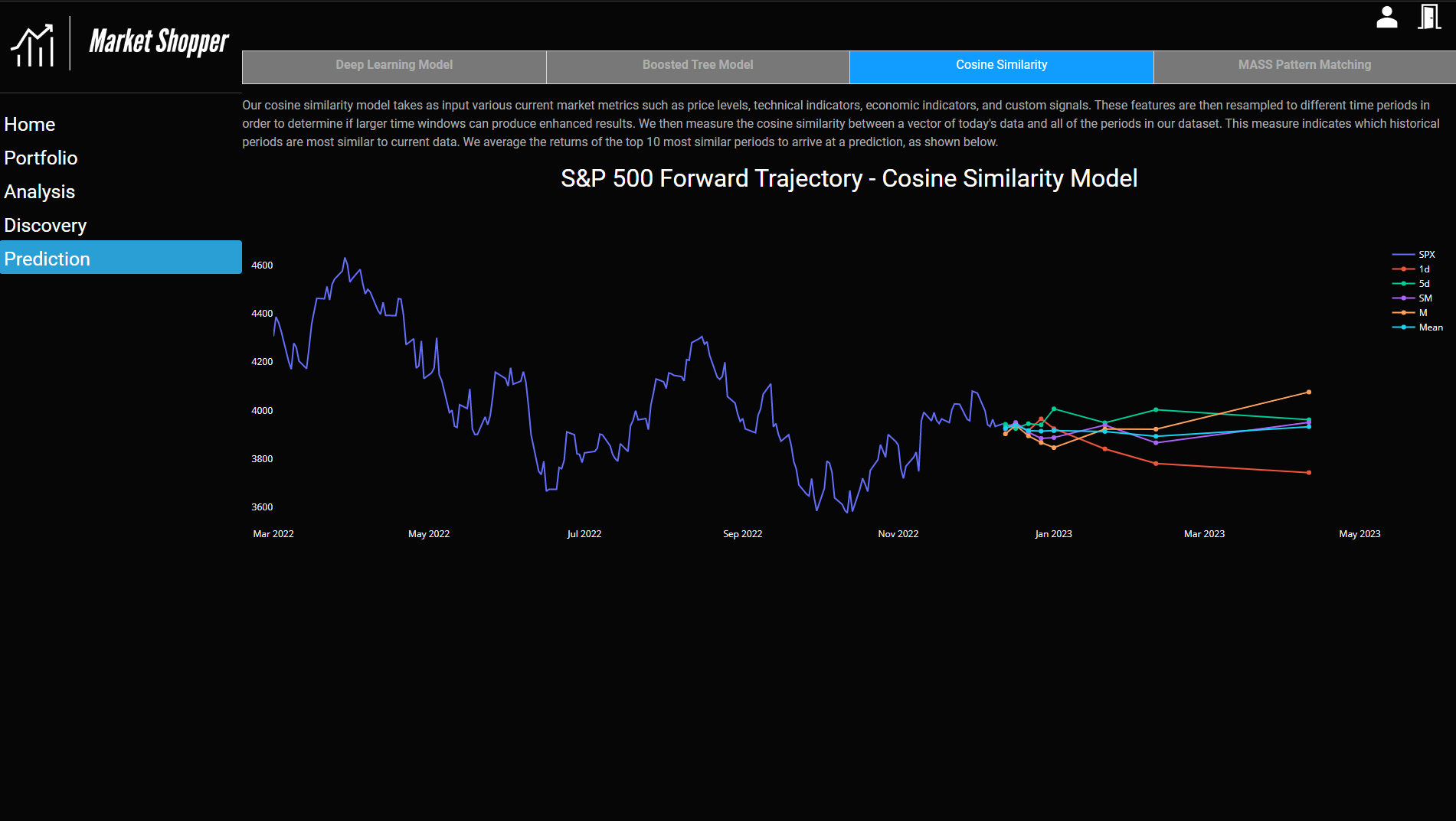
Cosine Similarity Model (Scikit-Learn)
We also investigated modeling our predictions by examining the cosine similarities of a vector of today’s data with our historical dataset. The historical dataset was sorted by cosine similarity to find the most similar historical periods. We average the forward returns of the top 10 vectors and present this as the forward prediction.
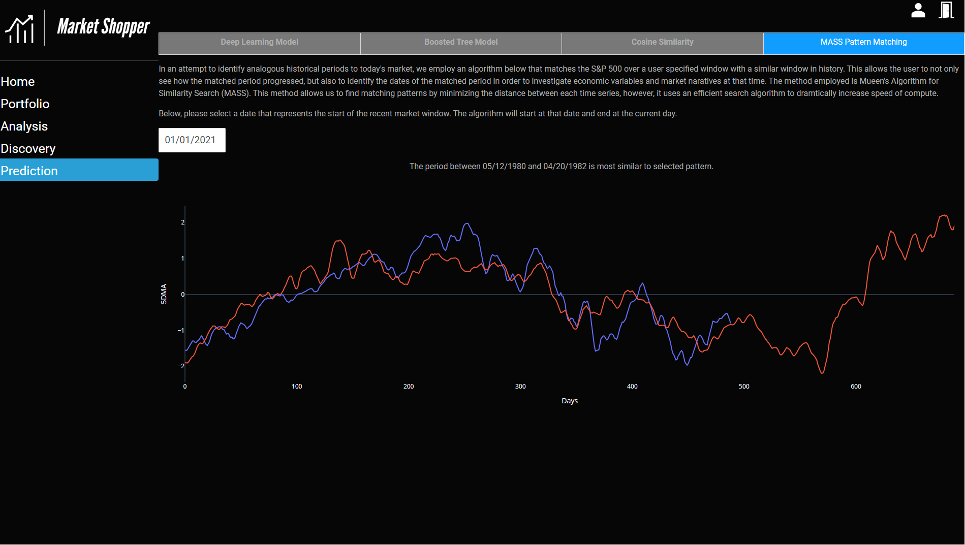
MASS Pattern Matching Algorithm (Stumpy)
We also wanted to provide user interactivity around the prediction models, so we implemented a pattern-matching algorithm via the Stumpy library. This model takes, as input, the starting date of a calendar window and ends on the current day. The model then uses an algorithm called Mueen’s Algorithm for Similarity Search (MASS). This algorithm essentially tries to minimize the distance between the time series window that we supply with a rolling set of windows, however, the algorithm uses an efficient search that drastically reduces compute time. Users can see an overlaid pattern of their specified window on top of the matched pattern. The model also outputs the corresponding dates of the matched periods so users can investigate historical economic and market narratives.
Ethical Concerns
One of our prediction models, the MASS pattern matching algorithm, is very sensitive to the user-specified prediction window. For example, as of this writing, utilizing 1/1/2021 as a start date matches a time period in the early 80s. However, utilizing 1/1/2020 matches a pattern during the start of the Great Depression. One could use this sensitivity to start dates and potentially build a false narrative to cause investors to panic sell.
Discussion
The collation of market indicators, portfolio measurements, industry averages, and prediction models in one application provides a broader view of an individual’s portfolio and overall confidence in the market than just the portfolio up/down signals. The application user can now view their portfolio and select future investments with confidence they are making decisions based on data and not emotion.
To achieve this data-backed approach, the application contains sections for the Portfolio, Analysis, Discovery, and Prediction. These sections were chosen as they focus on different key aspects of personal finance in that an individual cares about their current worth (portfolio), determines if their portfolio is effective (analysis), discovers new investments (discovery), and predicts how these investments will perform (prediction).
At the beginning of the course, we received feedback to limit the project’s scope. As we met complications with APIs for visualization and secure portfolio management, we began to refine our scope of data and the visualizations that could be included in the application. While the application no longer includes the Plaid API, we’ve simplified the portfolio management and continued to keep the user’s files secure and still present a compelling analysis.
Technical Mastery
Without the schooling from the University of Michigan - School of Information, this project would not have been possible. The students leveraged learning from the classes listed below to conceptualize, build, and deploy Market Shopper:
SIADS 521 & 622: Information Visualization I & II
In SIADS 501: Being a Data Scientist, we learned what data scientists typically do. The typical workflow always ended with organizing the results to share the valuable knowledge obtained or make a product. This form of communication was emphasized as the quintessential, so the Market Shoppers intended to share the results most compellingly.
For our project, the group worked backward with a web dashboard application in mind. While we had worked with Plotly and Dash in SIADS 622, we looked into other plotting libraries, like Altair, Bokeh, pyChartJS (ChartJS), and software solutions, like Power BI and Tableau, to understand the benefits and challenges. After experimenting with several visualization aids during the first weeks of the capstone course, we decided Plotly Express, Plotly Graph Objects, and Dash components would be the most robust, reliable, economic, and accessible libraries to undertake the project. Dash and Plotly enabled a multi-page dashboard application with routing and HTML styling integrated without requiring JavaScript expertise.
Each page was designed collaboratively, using graphing concepts and presentation techniques learned from SIADS 523: Communicating Data Science Results, to maximize the effectiveness of our analysis. Joshua Raymond first made a dashboard wireframe given the ideas we included in our project proposal, and each teammate took ownership of an individual page and its visualizations. The charts and tables consisted of marks fit for ordinal time series, quantitative KPIs, and mixed relational data.
SIADS 673: Introduction to Cloud Computing
Since the product was also built to educate, we looked for ways to host the dashboard for free, publicly. Google Cloud Platform’s Google Compute Engine virtual machines offer a free solution to run the Market Shopper server to anyone in the world to use and test the base features before tinkering or modifying with a forked version of the repository for personal use.
Additionally, we were able to utilize MongoDB for our JSON-based database. We utilized a paid MongoDB Atlas database hosted on the Google Cloud Platform to help enable better collaboration amongst team members. Since this database is hosted in Google Cloud, it ensured that our US-based team could connect easily with fast connections.
For model inference, we decided to remotely host and pre-compute values on an hourly basis to enable faster page loads and decrease the size of our application. Our inference architecture consisted of an AWS EC2 server pulling applicable data and running this data through our various models with their outputs being saved in an AWS S3 bucket. Our application then quickly draws from those repositories upon page refresh.
SIADS 643: Machine Learning Pipelines
With quality code in mind, we leveraged Machine Learning Pipelines’ best practices to architect our application and structure our code while working asynchronously. Throughout the project, the Market Shoppers used branching to integrate and test new features from our project backlog. We preferred pre-trained models to inference on new data in real-time given the 3-month timeline and the project’s scope. This decision enabled the team to focus on building the application and coding, visualizing, and interpreting the results.
SIADS 502: Math Methods for Data Science
Although not directly coded, we utilized scikit-learn’s cross-decomposition module to perform supervised dimensionality reduction on the dataset. This dimensionality reduction was based on identifying principal components through eigendecomposition.
SIADS 642: Deep Learning
Our prediction pages in the Market Shopper application directly make use of content in SIADS 642. We employ a deep learning model in Keras that trains on a dataset of market features and learns the label of future returns over various time periods. This model forms the basis for our quantitative prediction of future market returns.
SIADS 655: Applied Natural Language Processing
The portfolio management platform uses Expert AI to analyze tweets and subreddits to develop a sentiment for various stocks.
Technical Stack
Dash + Plotly
While our team had several visualization libraries available to build a dashboard, we selected Dash, an HTML, CSS, and Plotly-compatible library. Dash offered documentation, community support forums, and robust functionality that allowed us to build and iterate quickly. Initially, we planned to integrate Plaid, a secure API for connecting to banking institutions live, but the API required JavaScript or NodeJS to activate another component called Link to work correctly. We decided against continuing with the Plaid integration to keep the application simple and limit the scope and complexity of the project since we already had a great deal planned. Instead, the team added an uploading feature in the account management page to still enable users to explore the features with a portfolio of interest (their own!).
MongoDB
Concerning data storage, the team utilized a combination of MongoDB and raw CSV files. For items that were pulling from APIs, such as the FRED, Yahoo Finance, and SEC datasets, we wanted the ability to store the data in a common repository that was easily accessible to all team members. MongoDB was the perfect solution for this as it uses lightweight JSON for storage, has an option for deploying in the Cloud, and has a great library for interfacing with the data in Python, PyMongo. Although we had to pay to utilize the cloud tier for the project, MongoDB offers a free community version that installs locally. We plan on utilizing the community version after the project concludes.
Docker
One of the most challenging aspects of data science is getting the project to work outside of the development environment. Docker was a perfect solution that allowed us to containerize our application, transferring our code and environment variables into a downloadable file. The intricate details to start the app are abstracted away from the user and are simplified to a few commands from the README.md file within the repository. The Build your Python image doc was quintessential in helping to upskill on the technology and push the first image initially.
GitHub
To help ensure we kept track of all code changes as each team member developed, we used GitHub for version control. Most team members were familiar with GitHub from previous projects and, if not, easily became reacquainted with concepts. GitHub also helped us merge our code bases into a common repository and resolve conflicts when they occurred.
Amazon AWS EC2
For fast loading times in our prediction pages, we opted to pre-compute as much of our model inference as possible. To that end, we spun up a server on Amazon AWS EC2 to fetch model data and pass this through our several prediction models. The outputs of these models are then saved in an Amazon AWS S3 bucket, where they are made available to our application. These models are updated and refreshed every hour via scheduled cron jobs.
Statement of Work
The team for this project consisted of Tia Burton, Josh Nacey, and Joshua Raymond. The team all had various roles in the project and contributed in different ways, as stated below:
Tia Burton
tiareina@umich.edu
- Sentiment analysis inference
- Portfolio page visualizations
- Portfolio risk and opportunity analysis
- Flask/Dash multi-page integration
- Docker image
Josh Nacey
nacey@umich.edu
- Data Curation & Cleaning
- ML/DL Model Specifications and Training
- AWS Cloud Inference Architecture
- MASS Algorithm Implementation
Joshua Raymond
josharay@umich.edu
- Data Retrieval & Storage
- Application Wireframes
- Discovery Page Visualizations
- Individual Stock Predictions
- Google SSO Integration
References
FDGT Academy. (2021). KDJ INDICATOR. FDGT Academy. Retrieved December 11, 2022, from https://fdgtacademy.com/kdj-indicator/
Fitzgerald, M. (2021, April 8). A large chunk of the retail investing crowd started during the pandemic, Schwab survey shows. CNBC. Retrieved December 12, 2022, from https://www.cnbc.com/2021/04/08/a-large-chunk-of-the-retail-investing-crowd-got-their-start-during-the-pandemic-schwab-survey-shows.html
Hayes, A. (2022, July 2). How to Calculate Z-Score: Definition. Investopedia. Retrieved December 12, 2022, from https://www.investopedia.com/terms/z/zscore.asp#:~:text=A%20Z%2Dscore%20is%20a,identical%20to%20the%20mean%20score
Hilpisch, Y. J. (2020). Trading Strategies. In Python for finance: Mastering Data-Driven Finance. essay, O’Reilly Media.
Holton, G. A. (2002, July 25). History of Value-at-Risk: 1922-1998. University of Pennsylvania - The Wharton School. Retrieved December 12, 2022, from http://stat.wharton.upenn.edu/~steele/Courses/434/434Context/RiskManagement/VaRHistlory.pdf
Kenton, W. (2020, December 23). Roy’s Safety-First Criterion (SFRatio) Definition and Calculation. Investopedia. Retrieved December 11, 2022, from https://www.investopedia.com/terms/r/roys-safety-first-criterion.asp
Kenton, W. (2022, June 3). Understanding Value at Risk (VaR) and How It’s Computed. Investopedia. Retrieved December 12, 2022, from https://www.investopedia.com/terms/v/var.asp
Koehrsen, W. (2019, May 8). How to Generate Prediction Intervals with Scikit-Learn and Python. Medium. Retrieved December 11, 2022, from https://towardsdatascience.com/how-to-generate-prediction-intervals-with-scikit-learn-and-python-ab3899f992ed
Simon, D. (2022, July 2). 4 Key Portfolio Factors. Investopedia. Retrieved December 9, 2022, from https://www.investopedia.com/articles/stocks/10/4-key-portfolio-factors.asp
Walker, B. (2022, December 10). What is a Meme Stock? (A Guide for the Curious Investor). Yahoo! Finance. Retrieved December 11, 2022, from https://finance.yahoo.com/news/meme-stock-guide-curious-investor-162031128.html
Weighted Moving Average (WMA). (2022). Fidelity. Retrieved December 12, 2022, from https://www.fidelity.com/learning-center/trading-investing/technical-analysis/technical-indicator-guide/wma#:~:text=Weighted%20Moving%20Average%20(WMA)&text=A%20Weighted%20Moving%20Average%20puts,a%20
Wolverton, T. (2022, December 9). Google’s Sundar Pichai wouldn’t tell workers tech giant won’t have layoffs in 2023. Silicon Valley Business Journal. Retrieved December 12, 2022, from https://www.bizjournals.com/sanjose/news/2022/12/09/googles-sundar-pichai-leaves-door-open-for-layoffs.html
Appendix
Appendix A - Helpful Resources
Links to documentation and tutorials that were leveraged when building the application.
- Flask API Documentation - The Flask API documentation helped us get started with Flask
https://flask.palletsprojects.com/en/2.2.x/api/ - Jinja Documentation - Helped with the creation of the dynamic HTML pages including the Settings and Login pages
https://jinja.palletsprojects.com/en/3.1.x/templates/ - Dash Devtools Documentation - Defines the methods that can be used on the Application object within Flask
https://flask.palletsprojects.com/en/2.2.x/api/#:~:text=Application%20Object&text=The%20flask%20object%20implements%20a,template%20configuration%20and%20much%20more - Dash Reference (API Documentation) - Defines the methods that can be used on the Dash application object
https://dash.plotly.com/reference - D3 formatting for Plotly Dash Axis and Indicator display values - References and examples for formatting numbers in Plotly
https://github.com/d3/d3-format/tree/v1.4.5#d3-format - Creating and Updating Plotly Figures - Basics on updating Plotly charts and including callbacks to dynamically update them
https://plotly.com/python/creating-and-updating-figures/ - Plotly Indicator - Reference guide for displaying a single number along with formatting in Plotly
https://plotly.com/python/reference/indicator/ - Best Practices for a Multi-Page Dash App - Helped give best practices on how to setup multiple pages within a Dash application
https://dash.plotly.com/urls - Expert AI Model - The Expert AI model was used for the Sentiment Analysis on the Analysis page
https://github.com/therealexpertai/nlapi-python
Appendix B - Prospective Features
There are many items that we would have liked to include in our project but did not include either due to time limitations or technology constraints. Please see this list of prospective features below.
-
Correlation Analysis of Analyst Projections and Model Predictions - Within the Discovery page, analyst projected growth and model predicted growth are both present. It would have been great to run a correlation analysis between the analysts’ projections and the model’s predictions to determine what type of relationship was present if any. If a relationship was present, it could then be presented back to the end user stating which stocks had the highest correlation between what the model predicted and what the analyst projected, giving them higher confidence in any given stock.
-
Model Accuracy over Time - To help track our model’s accuracy over time, we would have liked to store the model results and indicate how any given model is tracking by presenting a relevant score, such as the R2 score (coefficient of determination). Aggregated results tracking would help give the user confidence that if a particular model is performing well over the past few days, it will continue to perform well in the future.
-
Absolute Error - While the prediction of an individual stock on the Discovery page includes the 5th and 95th percentiles to demonstrate the uncertainty in the prediction, we believe that the prediction could have benefited from an absolute error calculation to help demonstrate how far away the predictions are from the actual stock price value.
-
Data Refresh Buttons - While the datasets were planned to be updated daily through various functions and a batch file, we wanted to provide a method to allow the dataset to be updated on demand. We could have easily achieved this by adding an “Update Dataset” button to a configuration page that would kick off the update in the background. Unfortunately, due to time constraints and the priority of other items, refresh buttons were not included in the project.
-
Future Growth by Industry/Sector - The past growth of a given sector and industry is shown on the Discovery page using a box plot. The future growth of a given sector and industry could have been shown using the same box plot method by taking either the analyst prediction data, model prediction data, or both, to help demonstrate how an individual sector or industry is expected to grow or shrink in the next year.
-
DVC - For this project, we focused on building a minimum viable product to ensure our users got the most out of the educational and analytical information presented. DVC tracks the data within the Twitter and Reddit sentiment folders. The version control software could also enhance some of the modeling result tracking, data tracking, and automatic refreshes implemented in the product’s alpha version. For example, the tracked data is being updated and cached with methods and functions created by the Market Shoppers team. This process could, however, be transitioned and made faster and more efficient if DVC were to trigger the workflow to compute the sentiment of the stored text data and save a version of the results.
-
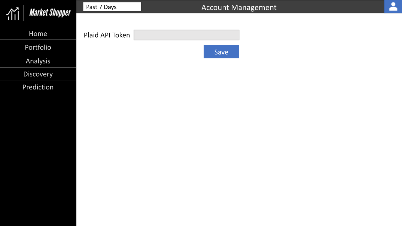
Plaid API - The alpha version of Market Shopper was simplified to help complete the project on time. We initially wanted to include the Plaid API as it offered a secure way to access data from a user’s authentic account with a financial institution. For Plaid to work, there needs to be Python integrated with Link, which requires JavaScript or React components. An app enhancement that should make a beta version of Market Shopper would be the means to connect securely. The portfolios would stay updated without manually entering the investment account information into a spreadsheet and then uploading it to the tool to get the analysis. It would be embedded into the registration workflow and associated with a Google account.
-
Web Hosting - To make our work accessible, we wanted to set up a virtual machine. Initially, we deployed the application on GCP Google Compute Engine. The container was deployed successfully but didn’t run on start as planned. A workaround was to run the container with ‘tmux’ and ‘flask run’ from the command line interface; the logs for this method revealed the size and RAM of the free machine, a micro E2, were insufficient to run our multi-threaded process. Another free platform for deployment was PythonAnywhere by Anaconda. A similar issue arose with this platform since there is limited RAM and storage for free projects. In future iterations of the application, VMs and other deployment infrastructure should be estimated by the project’s final size, so free credits and class-supported infrastructure are leveraged accordingly.
Appendix C - Project Challenges
The below items list some of the recurring challenges we had when working on this project. Fortunately, these challenges are common and can be mitigated for future projects.
-
GitHub Merge Conflicts - One challenge we kept running into was the conflicting code within GitHub. We would often have to do a pull after pushing code and resolve conflicts in the code base. These would sometimes take hours to troubleshoot to ensure everything worked properly. Towards the end of the project, we improved at segmenting code by ownership which helped decrease the merge conflicts we encountered.
-
Stack Complexity - Admittingly, our stack is quite complex for a 3-month project. We incorporated Python, Flask, Dash, MongoDB, Google SSO, Google Cloud, and EC2, among other technologies. While these technologies gave us flexibility in how we developed our app, they also presented several challenges with concerns about integrating all of these technologies. If we had spent more time upfront architecting the solution and investigating technologies, we could have developed a more streamlined technology stack.
-
Project Scope - Our project had an ambitious scope. It’s safe to say that we are all happy with the results and ability to accomplish so much in so little time; however, the project could have benefited from a more limited scope to ensure a quality end product. Additionally, once we accomplished our original scope, we could have then expanded it to include more features.
-
Performance Degradation - Due to using Dash and dynamically loading data frames from either CSV files or the MongoDB database, there is some performance degradation in the app when visiting a page or applying a new filter. We have worked to mitigate this degradation through a local disk cache and background callbacks. However, the application is still not at a point where we feel it is performing well from a response time standpoint. Other options to explore would be storing all results in a database, only loading a subset of the data on page load, and moving the database closer to the application.
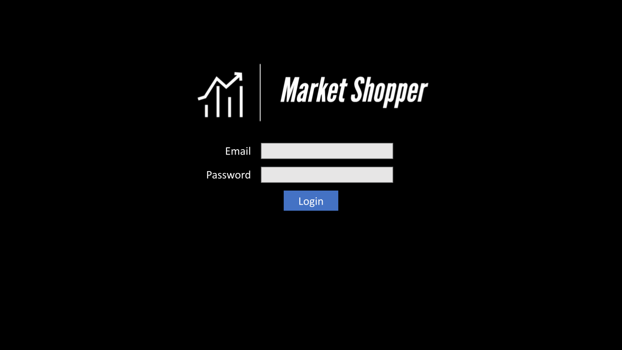
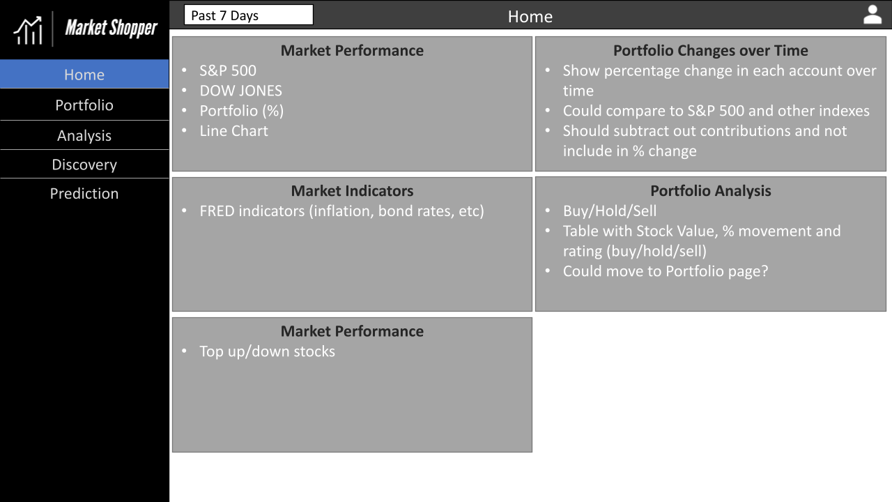
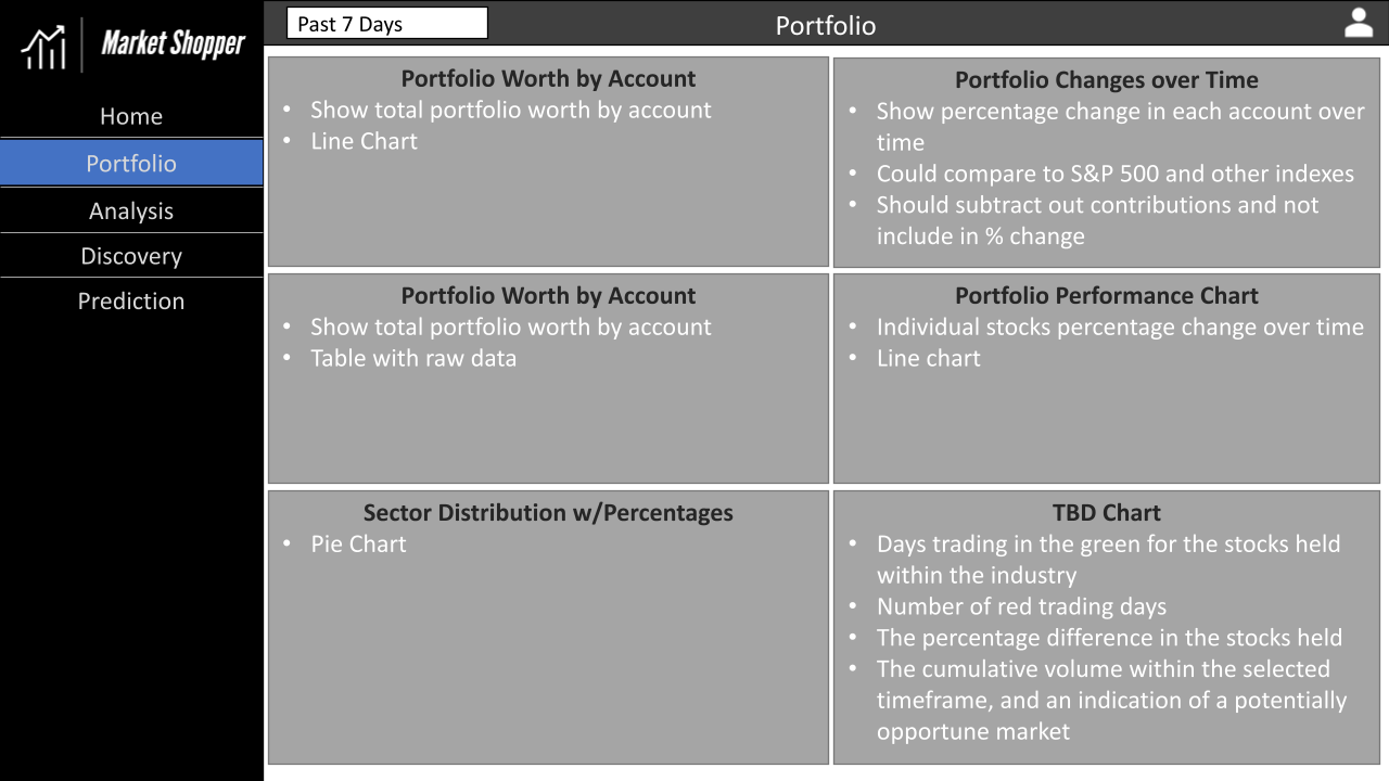
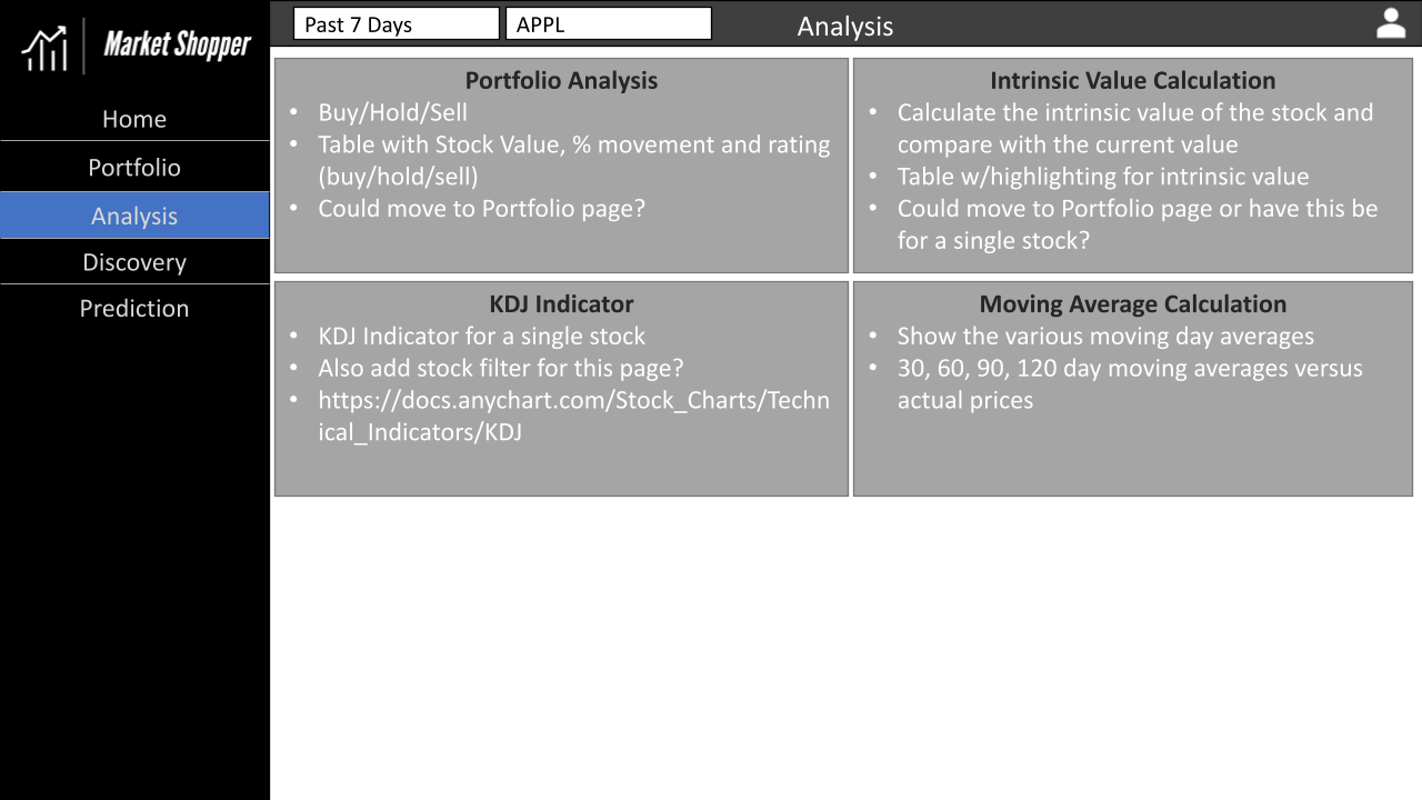
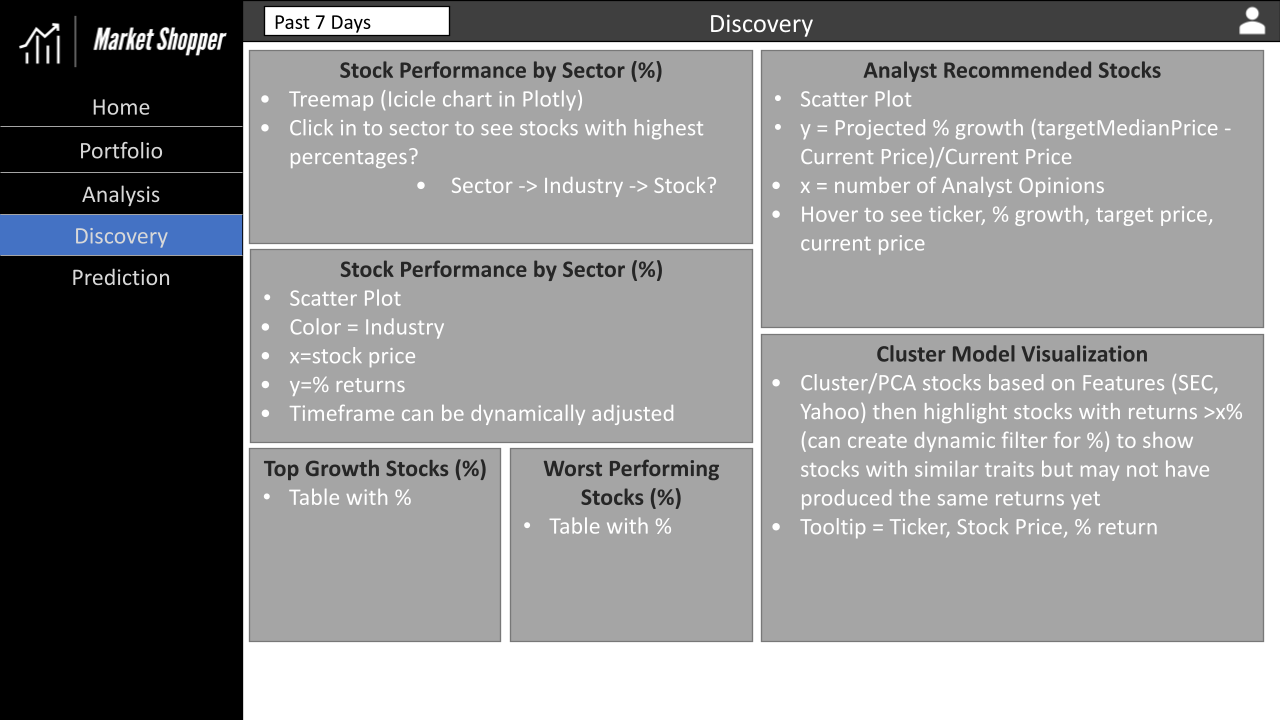
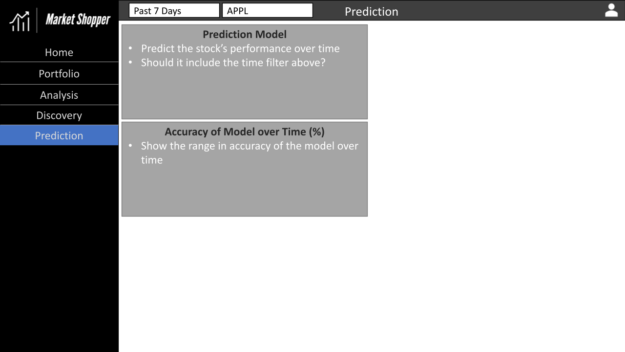
Appendix D - Application Wireframes
The wireframes we developed for the UI of our application are below. Overall, we hit the mark pretty well except for the login page, for which we used Google SSO instead.